Sunday, June 30, 2013
Similarity Matrix

A similarity matrix is a matrix of scores which express the similarity between two data points. The above map shows effect of the landscape matrix on the distribution of dung and carrion beetles in a fragmented tropical rain forest.
Star Plots

Above are star plots of four different Alzheimer's patients. These segment diagrams of multivariate data sets can be used to campare treatment outcomes..
DLG

A Digital Line Graph (DLG) is a cartographic map feature represented in digital vector form that is distributed by the U.S. Geological Survey (USGS). The DLG above is also a DEM map of the US.
DRG

Above is DRG map of Yosemite National Park. A digital raster graphic (DRG) is a scanned image of a U.S. Geological Survey (USGS) standard series topographic map.
Isopleths

Isopleths of mean daily precipitation during the driest months of the year in mm are overlain onto four land-cover classes in the Amazon basin. Isopleths are lines drawn on a map through all points having the same numerical value.
Isopach

Some geographers have a need to know the thickness of various rock formations. They would use an isopach map similar to the one above.
Isohyets

Above is an isohyet map of Flofida. Isohyets depict levels of rainfal.
Wednesday, June 26, 2013
Isotach

http://www.intellicast.com/National/Wind/WINDcast.aspx?region=eyw
Lines on a map connecting points of equal wind speed are shown in this isotach map of South Florida.
Isobar

Isobars are lines connecting points of equal atmospheric pressure. The above map depicts atmospheric pressure in Europe.
Tuesday, June 25, 2013
Correlation Matrix

Above is a correlation matrix. It displays trends among investment sectors of the S&P 500. A correlation matrix is a matrix giving the correlations between all pairs of data sets.
Continuously variable proportional circle map

Above is a continuously variable proportional circle map showing motor vehicle deaths by region. Southern Califirnia has a lot of bad drivers.
Classed Choropleth

The map above is a classed choropleth map that portrays states views on the value of human life. Often data for states, counties, etc. is combined into a smaller number of groups and portrayed in intervals
Wednesday, June 19, 2013
DOQQ

Above is a DOQQ (Digital Orthophoto Quarter Quadrangle) image of UT stadium. A DOQQ is an ariel orthophoto using infrared technology. Quarter Quadrangle refers to a map sheet size that is one-quarter of a 7.5 minute.
DEM

Above is a DEM (Digital Elevation Model). DEMs, such as this one, are typically used to represent terrain relief.
Tuesday, June 11, 2013
Dot Distribution

Dot distribution maps use dots to represent quantitative values pertaining to a specific phenomenon. The dots are perportianate to a represented value. In the map above, each dot represents 5,000 child deaths.
PROPAGANDA MAP
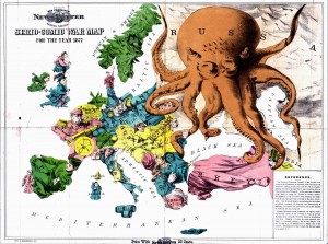
Propaganda maps are designed to influence viewers in favor of or against a specific cause. Above is a propaganda map of Europe with Russia depicted as an octopus with several regions within the grasp of its tenticles.
Hypsometric

Above is a hypsometric map of central Italy drawn by Leonardo Da Vinci. Hypsometric maps use color to depict relief.
Monday, June 3, 2013
Climograph

Above is a climograph of Tallahassee. Climographs show the relation of two or more meteorlogical variables. This one depicts percipitation and temperature.
Topographic

Above is a map of Tequesta, FL containing both topographic information. That is it shows elevation through the use of contour intervals represented by isolines..
Sunday, June 2, 2013
Nominal Area Choropleth

Above is a nominal area choropleth map depicting the results of the 2004 Presidential election by district. Nominal area choropleth maps provide nominal (nonranking) areal data using different colors. Blue regions represent favorable Democrat results and red represents favorable Republican results.
Bivariate choropleth map

Bivariate cloropleth maps provide information about two variable using color.
This map lists the location of Olympic athletes in various counties by Summer and/or Winter games.
Subscribe to:
Comments (Atom)